New Life Spaces: Nature-Derived Color Palettes
An interactive section for New Life Spaces' Biophilic Design page where nature photos reveal their own color palettes, each palette turns into real materials, and visitors can draw a palette from a photo of a place they love.
What shipped
The section is live on New Life Spaces' Biophilic Design page, so these are build and engineering figures rather than traffic numbers.
Color, Borrowed From the Living World
New Life Spaces is a design-build remodeling company in Upstate New York, and biophilic design sits at the center of how they work. The owner wanted to show visitors that biophilic design is much more than putting plants inside a house: nature can inform color, texture, material and light, and the relationships between them. He had seen short social videos that pull a few colors out of a photo of a bird or a flower, and asked whether the Biophilic Design page could do something similar, but properly, in the company’s own aesthetic.
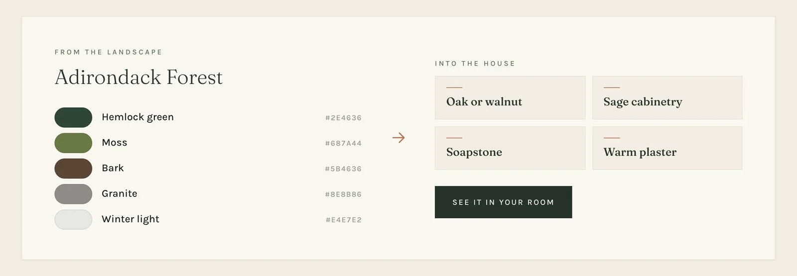
His brief was specific and generous at the same time. Six to eight striking nature photographs. Hover or tap one and a palette of four or five colors emerges from it. Then take it a step further and show how New Life Spaces would translate that palette into an interior. He gave three examples in his own words, such as Adirondack Forest: hemlock green, moss, bark, granite, winter light, translated into oak or walnut, sage cabinetry, soapstone and warm plaster. Longer term, he wanted it to become part of the design conversation itself: instead of asking clients which paint colors they like, ask them “Which of these places feels most like home to you?”
What I built
A new section on the live Biophilic Design page, placed after “How we approach it” and built to match the page exactly: the same display and body typefaces, the same forest, moss, sage and clay palette, the same small tracked labels and hairline rules. It carries its own small stylesheet so it doesn’t depend on the page’s precompiled Tailwind build, and it slots into the existing page template through a single new action hook, so nothing else on the page changed.
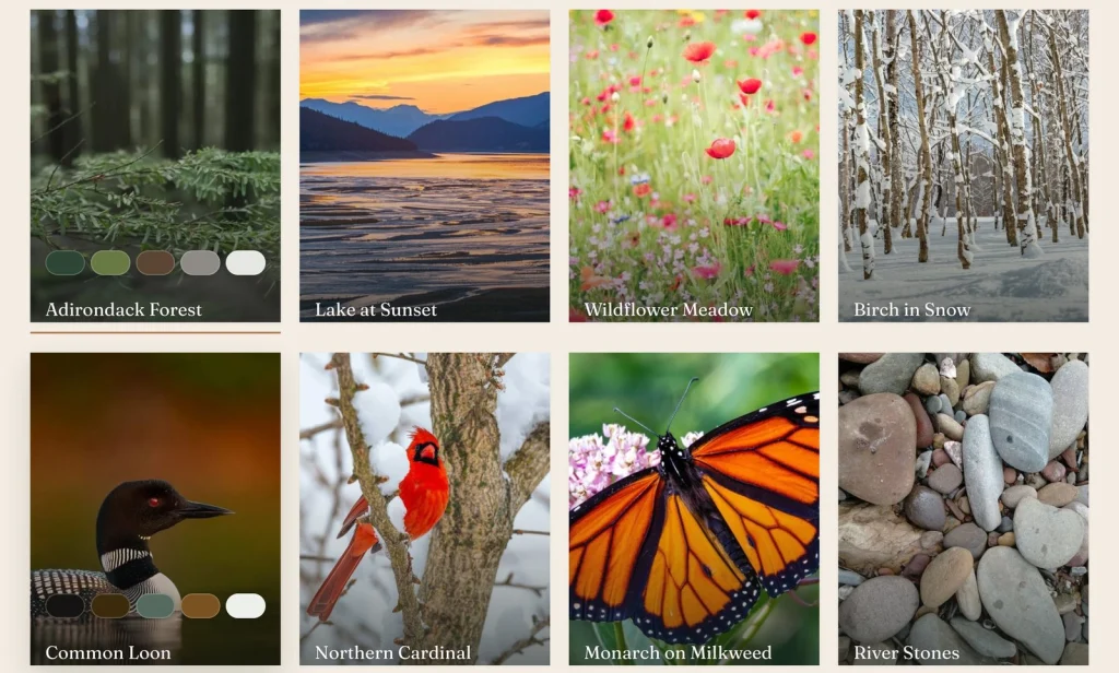
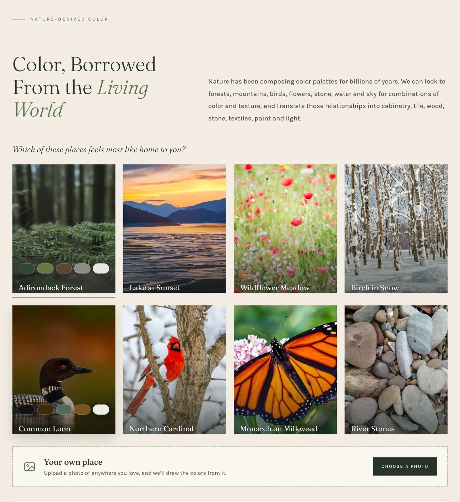
Eight nature cards sit under the owner’s own heading and intro: his three examples, plus five more chosen to feel local to the region, a birch stand in snow, a common loon, a northern cardinal, a monarch on milkweed and river stones. Each card shows its photograph with a soft shade at the foot. On hover or keyboard focus, the palette rises over the photo as a row of rounded color pills, one after another, the same gesture as the examples he sent, refined. On touch screens, where there is no hover, the colors are simply shown.
From the landscape, into the house
Choosing a card fills a panel underneath with the translation the owner described. On the left, From the landscape: the place’s colors as large swatches, each with its name and color code. On the right, Into the house: a small material board, one tile per material, built from the company’s own words. Each panel ends with an action, so the section never leads nowhere.
Your own place
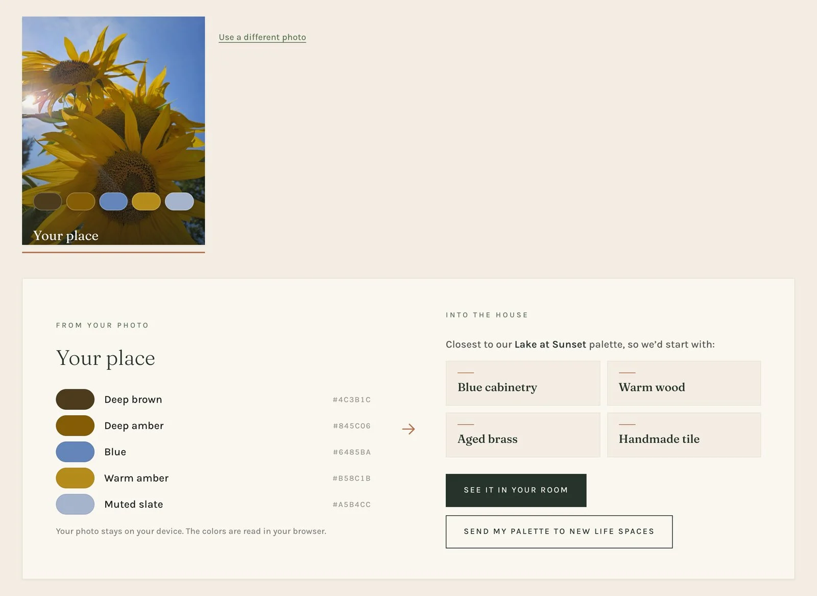
The owner’s long-term idea was to let people bring their own sense of home into the conversation, so the section ends with a Your own place band. A visitor uploads or takes a photo of anywhere they love: a camp on the lake, a garden, a view from a porch.
The photo never leaves their device for this step. It is read in the browser, scaled down on a canvas, and five colors are drawn from it with a small k-means clustering pass, seeded across the brightness range so dark and light tones both survive. Each color gets a plain, readable name (“Deep amber”, “Muted slate”) from its hue, saturation and lightness, and no two colors in one palette share a name.
Their photo isn’t one of the company’s places, so its materials come from the closest of the eight. That match is measured in CIE Lab, the color space built around how people actually perceive difference, in both directions (their colors to the place, and the place to theirs), with vivid colors weighted more heavily, because a sky blue or a cardinal red is what makes a palette recognizable. As a sanity check, every one of the eight photos matches its own place.
Connected to the Room Visualizer, and to the team
The section isn’t a standalone toy. It plugs into the Room Visualizer, the AI chat assistant I had already built for New Life Spaces.
- See it in your room opens the assistant with that palette already chosen. The visitor uploads a photo of their own room, and the AI redesigns it from the palette’s colors and materials, next to a real New Life Spaces project of the same room type. On this page the assistant asks “Which of these places feels most like home to you?” instead of offering the usual design styles.
- Send my palette to New Life Spaces turns a visitor’s own palette into an inquiry without needing a room photo: their details, the room, a line on what drew them to that place, and a summary with their color swatches before it sends. The team receives the palette as swatches with codes and names, the closest company palette and the note, in WordPress and by email.
Safe by design
A visitor’s own palette reaches the AI as data, never as text. The server accepts only three to five color codes and the key of one of the company’s active places, and it names the colors itself, so nothing a visitor types can find its way into the AI prompt. I tested it the obvious way: a palette with a sentence slipped in among the color codes is refused outright. Everything else, the bot protection, the one-free-design allowance and the daily cost cap, is inherited from the Room Visualizer.
Edited on the page itself
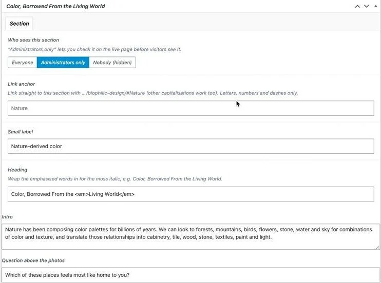
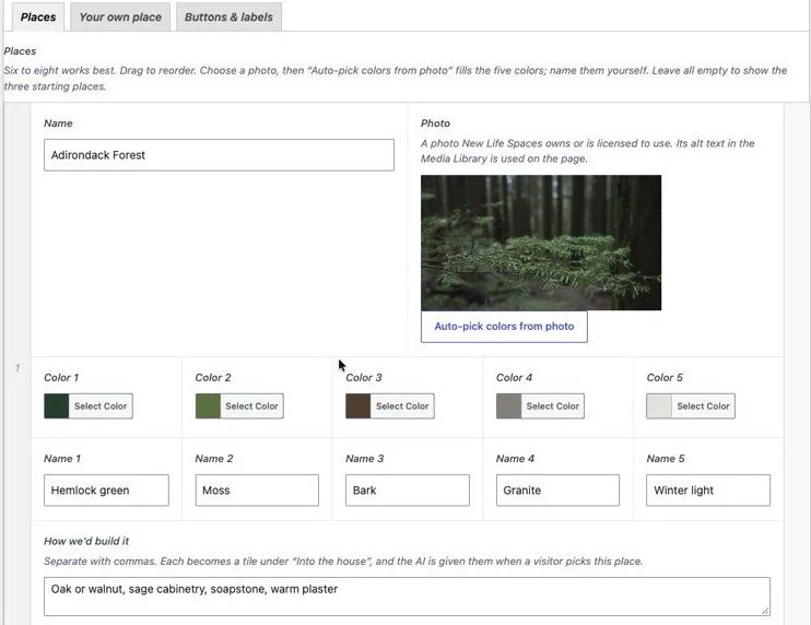
The owner edits everything on the Biophilic Design page in the WordPress editor, through an Advanced Custom Fields box laid out in four tabs, the same approach the rest of his Design Philosophy pages already use:
- Section: who can see it (Everyone, Administrators only, or Nobody), the link anchor, and every line of text, including the heading with its italic accent.
- Places: up to eight, drag to reorder. Each has a name, a photo from the Media Library (its alt text is used on the page), five colors with color pickers and names, and the “How we’d build it” materials. An Auto-pick colors from photo button fills the five colors from the chosen image, using the same method as the public upload, and leaves the naming to him.
- Your own place: switch the upload on or off and edit its wording.
- Buttons & labels: every button and label in the section.
The section, the assistant’s list of places and the server’s allow-list all read these same fields, so there is one source of truth. The “Administrators only” setting let us launch it on the real page, in front of the owner, before visitors saw it, and a link anchor means the team can link straight to it.
Where it stands
The section is live and public on New Life Spaces’ Biophilic Design page. It launched with eight demo photographs from Unsplash so the idea could be seen working on the real page, ready to be swapped for the company’s own photography from the page editor at any time. The owner’s three example palettes are in his own words; the other five carry suggested wording for him to refine.
Nature First, Paint Deck Second
Most remodeling sites ask visitors to choose finishes. This one starts somewhere else: a forest, a lake at dusk, a loon, a photo of their own favorite place. It quietly shows how New Life Spaces thinks about design, and turns that first moment of recognition into a palette, a material board, an AI design of the visitor's own room, or a conversation with the team.
More work

Iceland Review: Stopping the Bot Attack Behind Weeks of 502 Errors
Weeks of 502 and 504 errors on Iceland Review's WordPress site turned out to be a large-scale bot attack on old, forgotten URLs. I traced it in the server logs, stopped it, and put a layered defense in place so the next one is stopped automatically.
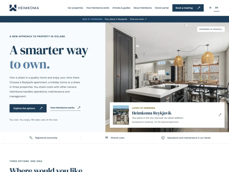
Heimkoma: Bilingual Static Site Migration
Moved a Reykjavík property company from WordPress, a page builder and machine translation to a bilingual static site that publishes itself in fifteen seconds whenever the client pushes a change.
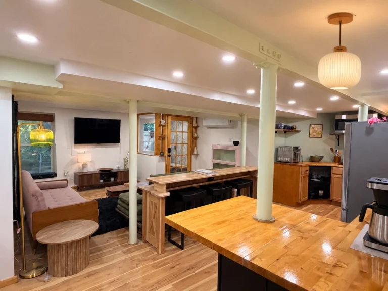
New Life Spaces: Room Visualizer AI Chat Assistant
A custom WordPress chat assistant that turns a visitor's room photo, gutted or finished, into an AI redesign in New Life Spaces' own styles, shown next to real project photos and wired straight into lead capture.